Next weekend I am attending the premiere screening of my first film festival film, Shikashika at the True/False Film Festival in Columbia MO. This documentary festival in its 5th year is a perfect fit for what I do and was actually my first choice for premiering this little 10 minute film. I couldn't be happier about this placement. The film has also been programmed into four other festivals that are listed on the Shikashika website in my signature.....very encouraging for a 2008 release in February.
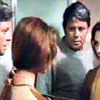
This said, I am a bit behind on creating promotional materials to take to the festival. All I really need is a good postcard and website as far as I can tell so I've spent a good bit of time on the website (linked below) and also today I made the post cards (to be resized smaller) that I have posted below. (front and back sides)
So are these postcards enticing? Do they raise questions? Do the confuse? Are they amateurish (in a bad way)?
I can't look at any of this material objectively anymore. I'm way to close to all of it so feedback would be very helpful.
FYI: if you click the image it should expand to larger and clearer
REVISED: 2.24.2008 (here is the less as more version)
Last edited by steve hyde on Mon Feb 25, 2008 3:09 am, edited 1 time in total.
I've been trying for the last couple weeks to save some cash on the side to make it down there Steve but I'm tied down by rent. If something comes up that I can attend the Saturday showing, I'll make sure to give a first hand report in this thread!
Have you thought of hiring or asking a favor of someone experienced in promo art to put together your postcards?
I don't mean to sound like I'm busting your stones, but honestly there is nothing about your postcards (Presentation and even the written blurb) that makes me want to see your film.
Don't get me wrong, it's a serious acomplishment getting into a fest, the formats are encourging, and it's perfectly understandable if you have spent every waking moment (And even some time in your sleep) seeing your vision through, it's the nature of the beast, but at this stage of the game, when your whole vision is to be condensed down to the powerful experience of something the viewer can actually hold in their hands, don't drop the ball with anything less than stellar, call in a pro, because to be brutally honest, I doubt upon 1st glance "This looks like some crappy photoshop junk!" is the reaction you want your hardwork and creative vision hinged upon.
If I had to guess, I would say you have lived and breathed your project to the point that you aren't even seeing it anymore, but the right artist experienced in promo material can whip up something very cool and fresh and pro in like ten minutes, so don't feel all is lost or it is too late at all.
Actually I rather like the graphics of the post card. It has a stark visually catchy look with the colorful portraits on the black, probably glossy backround. It makes me want to know the people in those portraits because they stand out graphically. The text on the card is definately informative, but maybe it lacks some tension which could grab a prospective viewer. Is there a character(s) arc of any sort in your film? Is there some opposition the character(s) have to overcome which can give a dramatic angle to the text? This opposition could pose a question which could make the viewer want to see the film. Maybe you could focus on one person, make it personal, his/her desperate task in pristine yet perilous surroundings, fending for their family, opposed by elements, modernity/industrialization, government, competition, sickness, and he/she represents the story of the people who perform these arduous tasks. The elements seem to be there. Just try to add a little more tension, put an angle in there. Actually I like what you've done, and it looks like a great project! Congrats on being accepted at those festivals. Good Job! Super!!!
I think if you can afford to print postcards and get on a plane to a film festival then you can afford someone to design them - at a pinch they'd do as they are but could be better (as my school teachers used to say). The graphic design rule - to be broken - is that everything should line up with something else. Have a look at the work James Cauty is doing graphically - and then just steal it! (He asks people to). And then there's flyers as well - A5 bits of decently made paper with some black and white printing on - to hand out and occasionally sign (to be auctioned years later on the future ebay).
Hi Steve - I checked out your web page about a month ago actually and liked it - I'm quite interested in seeing the film - just for the subject matter, let alone for the film making side of it.
I think the graphics style works well on the web page but not on the poster. I think on the poster maybe consider more symmetry, blur the edges of the frames like you did on the frontpage of the web site, and maybe put something on the background - black like that just seems to me to be too undetailed - just some faint but manly black image would work well I think. Also maybe put the main credits in centred style under it.
Don't know - just what I'd do - not saying it's what's best.
Good luck with the project and congratulations on the festival screening!
Scot
Read my science fiction novel The Forest of Life at https://www.amazon.com/gp/product/B01D38AV4K
...thanks very much for the thoughtful feedback!!! I need eyeballs on this stuff and yes - I need a graphic designer.
Also thanks for the critical feedback on the log line and synopsis. That stuff is actually quite difficult. I imagine I'll learn a lot about my film at the festival and will make revisions as I go. Festival screenings seem to me a key component of the creative process.
Again, thanks for the feedback and thanks in advance to anyone who has feedback to offer.
It's refreshing to see someone online that can actually accept constructive criticism with tact, so noit that it matters, but big points for it.
I'm obviously no graphic artist, and I don't mean to beat a dead horse, but if you were looking for a place to start (On the image), then I would suggest selling that mountain, it's a deadly obstacle overcome by determination. One look at that mountain, and a SHORT ringer sentence about the will and determination of the people that face it, and you have an instant visual story or notion of the human condition in the minds of those holding your postcards.
What better to document than the human condition overcoming huge odds to survive, right?
If I knew how to upload a pic here I would show you what I mean, but simply put, consider making that mountain pic half of the title image, place your ringer sentence just below it, then place the two kids and the boy in the bottom left and right corners, it will say it all.
I agree with some of the other guys about the postcard (I'm assuming it's front and back, rather than two cards...)
The photos are 'nice' but I'd like to see something a bit more to do with the story - hacking the ice, the donkey ride, selling at the cathedral, etc.
The font / layout needs work to make it look slick enough to compete with those who'll go the professional design route. At the moment it doesn't look designed... but it seems like you know this already!
I don't like your tag line because it references the title without describing what it actually is. Sure your summary explains all but as a tag its vague and a little cheesy to be so self referential with an obscure word. I actually always preferred your old title, which I think was "The Ice Harvesters of Peru" which while less arty does aptly describe what its all about.
The postcard also fails to list the venue and screening times, which hobbles it as a promotional tool.
However the truth is we are talking about a short film and a snazzy postcard is not going to put bums in seats. The people who love festivals and short films have already bought tickets. Its useful to have something to hand out of you meet some hot babe at a party and want to give her a private screening but realistically the general world doesn't care about shorts and the festival will already have advertised to the movie buffs in town who do care. What you've got looks pretty good. Save your money
for your feature and hire a wiz kid for that.
Since post-cards are given out by Everyone to Anyone at film festivals their ability to get eyeball in seats isn't the most effective.
After a night of partying you will have stacks of them.
Which leads to a bigger questions beyond layout.
My only design advice is leave the laurels off unless you win. That way you can use them at other festivals without them getting cluttered.
If you are handing them out at True/False no need to advertise it...since you will be handing them to people at the fest.
It would be nice to know if True/False will have a screening room where all the filmmakers DVDs live and you can send people there to see it too. Then you can write your number on the postcard and send them there.
I'll cross my fingers for you. I know you have put in a lot of time on this film. Hopefully you will get some good response down there.
...thanks!! this feedback really helps. I've incorporated some suggestions and have replaced the above with the new working copies. I went for the less is more approach and maintaining consistency with the website. As this project evolves lots will change, but for now this little film just needs a home and a passport.
and yes - I'll make dvds available - just give me a bit of time. Thanks for your interest..